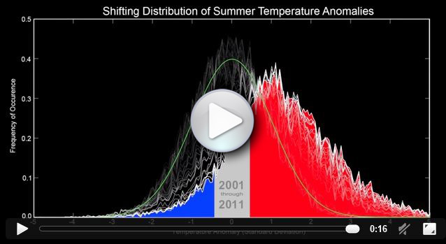
The NASA Goddard Space Flight Center has released a 16-second animation showing a shift in the distribution of summer temperature anomalies (that is, exceptionally hot or exceptionally cold days in the summer). The animation begins in the year 1950 and goes up through the year 2011. Click on the image above to see the video in a new browser tab or window.
Over the past few decades, the frequency of exceptionally warm summer days has increased, while the frequency of exceptionally cool days has decreased. However, even in 2011, there are still some unusually cold days, shown in blue on the graph. This highlights an important aspect of global warming: while the average trend is toward more days of extreme heat, there is still a great deal of variation from day-to-day. As a result of this variation, we should expect at least a few exceptionally cold days in any particular year. These cold weather events do nothing to undermine the reality of climate change, which is revealed by the long-term trend.
Although it is more subtle than the shift toward higher temperatures, notice that as time goes on, the bell curve shown in the video becomes shorter and fatter. This demonstrates that climate change is not only increasing average temperatures; it is also increasing the variance, or standard deviation, of extreme temperature events. Temperatures are not only increasing: they are also becoming more irregular. This may pose challenges for accurate weather prediction, and it means that extremely hot (and extremely cold) days will occur more often than one would expect simply based on an increase in the average temperature.
Animation courtesy of NASA/Goddard Space Flight Center GISS and Scientific Visualization Studio.

